As you may have noticed, I've managed to put up a new layout for this site like I said I would in the last entry! I hope that it makes it much easier to get around and more visually appealing for you. :D Also like I said, with this big ol' blog space on the front page, I plan to update more often throughout this year with various sketches and art and stuff related to the comic as I flesh out the script for the rest of the story. Please check back every now and then if you're interested!
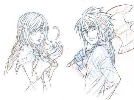
As a bonus, here's the line-art for the two header character art I've done so far. Instead of using a pen to ink the line-art, I drew the sketch in blue pencil and "inked" it with pencil, and so I like the nice softer effect it leaves? I plan to add header art for the rest of the characcters too in my spare time.
A lot of things were going a little haywire in the background over the last few days as I was putting this up, but I think most things should be working properly now? If you find anything that doesn't work, please comment in this entry to let me know about it, or if you have any suggestions you should leave a note as well :>
Wow! You’ve done a fantastic job with the layout! I looked around and the only thing I saw was that the thumbnails show a squished version of the actual image, I think it would be much more visually appealing if the thumbnails depicted a small cropping of the image instead of trying to squeeze the whole thing into such a small little space. Other than that, I really think you’ve done a marvelous job with the new layout. Indeed, it is much easier to navigate the site and read your posts and the parchment-like finish on the site and content backgrounds really adds a nice touch.
I’m glad you like the design, Amber :D I’ll fix those thumbnails like you suggested!
YAY! :) :) :) …still checking the site every day and voting :) YAY HANS! YAY DOD! <3!
Woohoo! An update! =D Looking forward to more of ‘em. =]
I’ve been using that technique to “ink” my images for a while until recently, when I’ve been doing all this comic-related work that I can’t get away with not inking… :( I really love the effect pencil gives, plus it gives me so much leeway in case I mess up, ha ha. I’m so bad with the smearing though, I always use a business card to cover my palm while penciling in.
LOVE THE NEW LAYOUT TOO. :D
Ohhh, that’s a good idea, using the business card! :O I usually draw with a harder lead so that it doesn’t smudge, but if I use a harder lead to ink then it does tend to get on my palms Dx I’m glad you like the site <3
I must admit that I’m going to miss the old layout, but this does make for easier reading. I think the colors and the gradients give this such a nice, soft, and ancient feel, whereas the old one made things look classy and academic. But everything is well done—I love the shades and the rotating headers.
Huh, sketching them that way does make them look softer. Nice effect.
My only problem here right now is the fact that your updates are on the home page. I’m more used to other webcomic formats, wherein the home page would contain the latest page of the comic, along with the author/artist’s commentary/announcements/updates in a less conspicuous place on the page.
This was fine in the old layout, since it was a lot smaller, but I’m afraid that people will be put off from reading this since the webcomic itself isn’t even on the home page. People new to the comic might not be so interested about the stuff you’ve planned for the site, since they have yet to see the goods, you know? But that could just be me, though.
But I look forward to more of your updates.:) I can’t wait to see what you’ll do for Unit 3! (Rest assured also that I am still voting for this site.)
Thanks for your well-thought-out input Enekoro :D My decision to put only a thumbnail of the latest page and not the full page was partly because for the time being, there won’t be any new pages until I finish fleshing out the story and have time off from school, which won’t be a while. I think if the first thing people see on the site is the same old page for months, they’ll be less likely to come?
But even for the long-term, I talked with some of my friends about it and we thought that because of the format of this comic, showing the newest full-sized page might not be the best idea? :
Hi there,
The new layout is really great, I like it much better than the last one, much more warming for the eyes, it will add contrast to help reading.
Have a great 2010 !
Hans,
Do you have your comic up at smack jeeves? There’s this good comic hub there that I think DoD can benefit from.
I don’t really like Smack Jeeves, it’s always felt kind of cheap and sleazy to me D: Maybe it’s the name, or the layout, or the page navigation. idk. I’d rather keep my site hosted on my own server where I can maintain control over everything and have my own domain name.
Is the vote incentive supposed to be different because I still get Ryan.
Whoa, revamped AGAIN! I’m lovin’ it! <3
ditto here :) I liked the softer colors more, but this way everything feels more…. “accented”? Interesting though :)
:D
Test?? D:
Mmmmmm-hmm.
Wow, I’m loving the story. i hope the next story would come out ASAP. nice work Mr. Hans!
I love the new layout. The colors mix beautifully and it certainly is easier to navigate. Hope to see some updates soon!