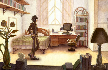
This is the first in a series of watercolor background paintings that I'm working on. :> Unlike the previous environment thumbnails which include places outside the school, these paintings will be exclusively of various areas within the campus of the Alatus Institute.
I stuck Zephan in there to see how it looks, but I'm kind of indifferent about it, because the tooth texture of the watercolor paper stands out a little too much :<a. Apparently if I used a really really good scanner the tooth won't stand out so much though, but by really really good apparently they mean like $1000+ good Dx. It's an interesting effect, but I think I'll try using a hot press smooth paper some time and seeing how it'd look once a character is slapped onto it.
Incidentally, even though Zephan's standing here, this isn't actually his room. D: It's just a showcase dorm, so maybe he's just checking it out on a tour or something D:

The windows are somehow like a leaf and the architecture seem to be elvish :P It is really interesting to see how high fantasy can actually influence a whole society :P
What? Another update? So soon? :D This is wonderful!
Everything does look grainy, but I do love the colors. It seems pretty standard (ooh, a huge closet! Now that’s a school that I can count on). It’s all so warm and cozy…wait. I know that you just put Zephan in there, but I’m surprised to see him inside a clean bedroom. The world will now implode.
update! :D
I admit the grainy/toothy texture can be detected, but it isn’t distracting in any way. Most of the furniture does look elven-influenced, but I personally think that it fits the look of the Institute.
Just wondering, is the square behind Zephan (seen behind the flowers) a picture frame or miniature safe?
So many places for books! :) Except I would probably fill half of those up with dolls and the other half with notebooks :p
What? XD Okay, makes sense it’s not his room, I thought his room was a LITTLE messier than that…
I didn’t really notice the graininess too much until you mentioned it, but if it really bothers you you can always use watercolor on illustration software :3 I agree with the others though, the graininess just gives it a soft/homey look <3
Anyway, I just think it looks really good! I like the perspective ^_^ Good job! :D
I don’t think so. I find the watercolor brushes in software to be less than accurate to real watercolors.
Maybe Azaela cleaned his room? xD Wow, really amazing job! I can’t wait to see more.
I like the graininess. It let me know this was a traditional painting and not digital. Call it a fetish, I just like to be able to distinguish between the two. Please tell me there will be one of the cafeteria or mess hall or whatever you want to call it. They probably dine in high style.
Oh, good idea :O I might do one of those down the line 8D Oh and I like the texture on the painting when it’s on its own, but with the character over it, it looks like they don’t go well together :[
Believe it or not, seeing this, I can just imagine an animated series of DoD, done in this style. That would be awesome. Don’t worry about the texture of the paper, it adds to the image, rather than detracts
An animated version! That would be so cool! <3