24
Apr. 2009

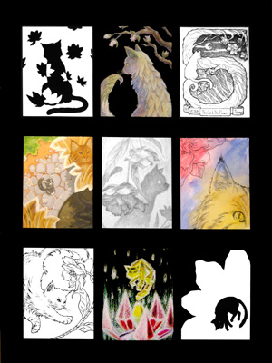
This was an illustration, or I guess a series of mini-illustrations, done for a class I had last spring taught by Dorte Christjansen, one of my very favorite professors I've had at Fullerton thus far. :D It was our first project and we were to choose two subjects and arrange them together in various ways based on certain criteria and illustration techniques she taught us, and being a fag for cats and plants of course I chose to do the flower and cat. :')
It was during this semester that I got Rupert. I think shortly after this project was due. Aheheh. >__> Even the little cat in the middle-left illustration looks like Rupert--I can't remember if it was just because I had already seen a photo of him, or if it was because I've just subconsciously always wanted a cat exactly like him. o_o
Anyway, mediums used in this project include pencils, color pencils, inks, watercolor, and gouache.
17
Apr. 2009
It's been a busy week, and it looks like it's gonna remain that way until next Wednesday at least, but I feel like lately I've finally been getting a better hang of managing my time properly. My room's actually pretty orderly and clean right now, which is to say that I'm not dying I guess.
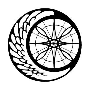
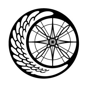
A long, long time ago I made the emblem for the Alatus Institute using just pen and rulers and stuff, and scanned that into the computer and somehow vectorized it using some shady freeware that I managed to find that automatically converted it for me. Of course, the nature of shady freeware that automatize tasks that require the intuition of a real live human being meant that the same vector file I've been using since 2002 or whatever has been fundamentally flawed, and me being a vector dummy did nothing about it.

Usually the logo was either small enough or obscured enough that I think most people probably didn't notice how crooked and crappily-made it was (or did they??), but it's always bothered me nonetheless. SO, one of the first things I did when I actually learned how to work with Illustrator (other than the Slime Mansion logo) was re-vectorize the Alatus emblem! Properly!

Woo new emblem woo silky smooth mmm!
...E-except when I showed my friend Tina, she commented on how the old emblem looked more organic while the new one felt a bit sterile. :< Ohwell. So now I've got some hand-drawn renditions of the emblem that I'm working on instead. 8D() I'm thinking that ultimately I'll probably end up with maybe three versions of the emblem: the current new one, a simplified one, and a hand-drawn organic-looking one. And I guess I'll just alternate between the three on a case-by-case basis?
ramblerambleramble I'm going to bed good night XO
03
Apr. 2009

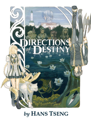
Not actually a real book cover though; this was a project done back in Spring '08 in my Illustration class. The assignment was to pick a book and create a new book cover for it using illustration techniques and mediums we learned in the class. I asked my professor if I could use my own book (so that way it's more relevant to the rest of my gallery 8D()) and she OK'd it, so this was what came out of it!
The whole thing was done in gouache on a big 18"x24" piece of I think watercolor paper that my professor gave to me, and one of the most distressing aspects about the project was finding a scanner for this thing! XO Originally it was scanned in pieces and put together on the computer, except the colors were totally crappy when I did that. Eventually we found a Kinko's with a large-scale scanner which I had to pay like $10 to use, but at least it gave me an image that was actually presentable! @_@
Incidentally, I did some more work on my Art Archives from Wednesday and now I have an automated script set up to thumbnail anything I upload and display onto the server on the fly. ;D This'll give me more motivation to upload my sketches cause I won't have to worry about thumbnailing them all the time now!! Woooo @_@
